Like the Behr Paint Company, Valspar Color and Benjamin Moore, the Pantone Color Institute’s colour experts always place one shade on a pedestal for the following year, giving it 12 months to shine. This fun tradition is meant to inspire people to try out new colours that they maybe wouldn’t otherwise and ignite creativity for interior design across the country.
For 2025, that colour is Mocha Mousse. Previous Pantone colours include Peach Fuzz, Viva Magenta and Very Peri, choices that brought the feelings and trends of that year to life. Now that we know what hue will be flying off the shelves this year, we’re here to provide some ideas to incorporate it into your home.
Using This Colour in Your Home
As we begin a new year, Pantone marks the occasion by selecting a colour that “captures the global zeitgeist — the colour of the year expresses a global mood and an attitude, reflecting collective desire in the form of a single, distinct hue.”
You might feel like it takes a full home redesign to make your space work with this rich colour. But think again. While that is an option, you can utilize it throughout your house in various creative ways. Here are some ideas for using this 2025 colour trend:
Focal Feature Wall
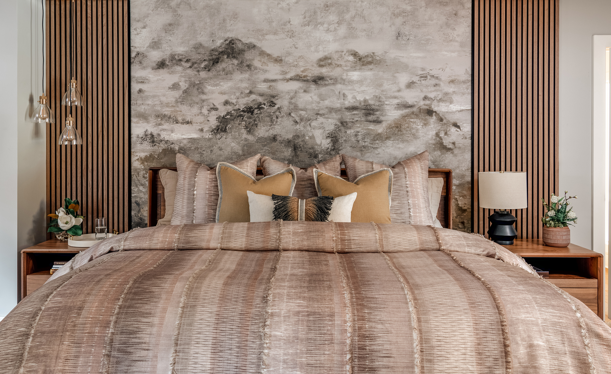
The nice thing about this velvety brown selection is it’s extremely versatile, meaning you can pair it with lots of different shades. One way to make your room pop without going too colour-heavy is to choose Mocha Mousse as your paint colour for one wall. This will create a rich, cozy focal point that exudes feelings of peace and quiet — even in the loudest households. Pair it with lighter neutrals like cream or light gray or go bold with a brighter option.
Full Room Repaint
Want to ditch your current home colour and select a new feature tint? Look no further than a luxurious brown. This shade is super cozy, making your room feel welcoming and comfortable for yourself and your guests. Use Mocha Mousse in enclosed spaces like a powder room, home office or small living room for a sophisticated and cocooning effect. Or, opt for a new paint colour in each room for a collective redesign that works wonders in any space.
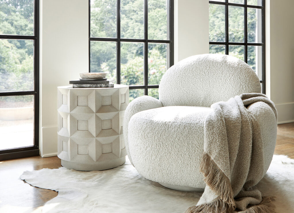
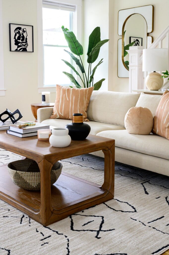
Cozy Sofas and Chairs
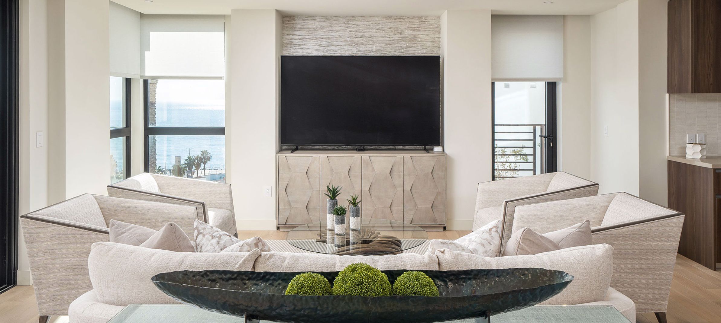
If you don’t want to introduce the colour in the form of paint, you’ve got plenty of alternatives. Take furniture, for instance. What better way to unwind after a long day than by sinking into a sofa in the shade of chocolate and coffee? You can use brown sofas or armchairs as a foundation to complement various home decor styles. This safe colour also pairs nicely with several aesthetics, making it an easy way to stay on trend without making your home look disjointed.
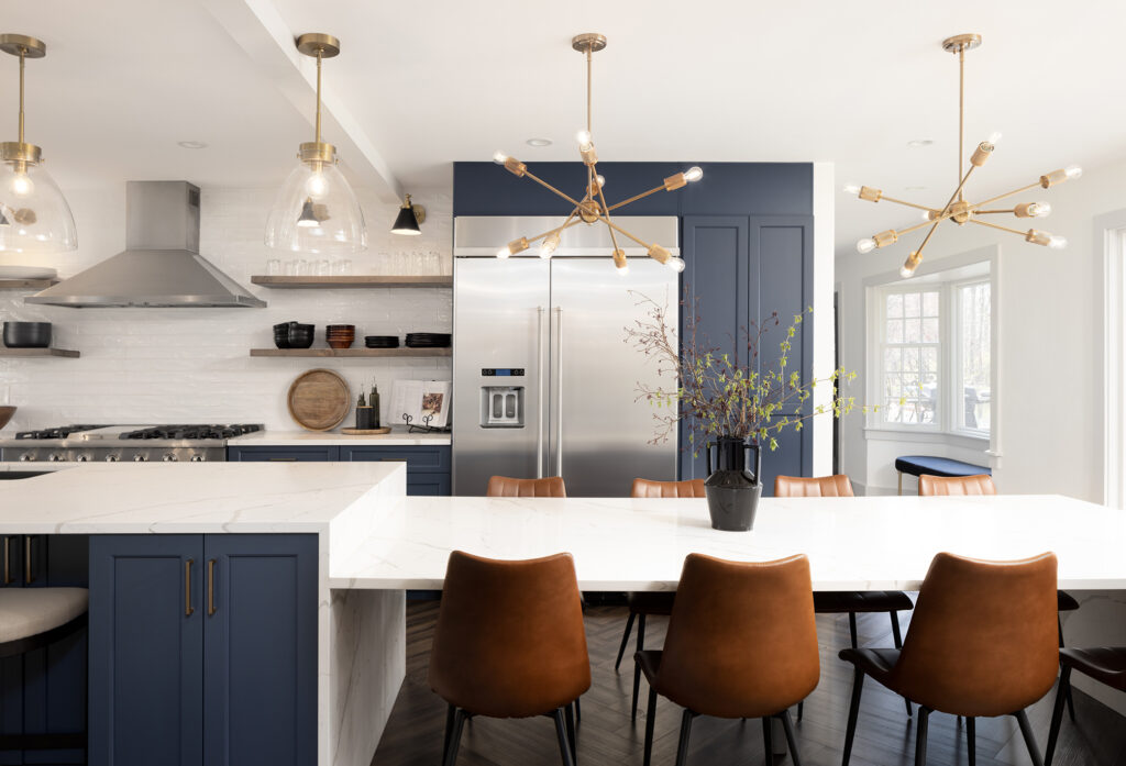
Warm Cabinetry
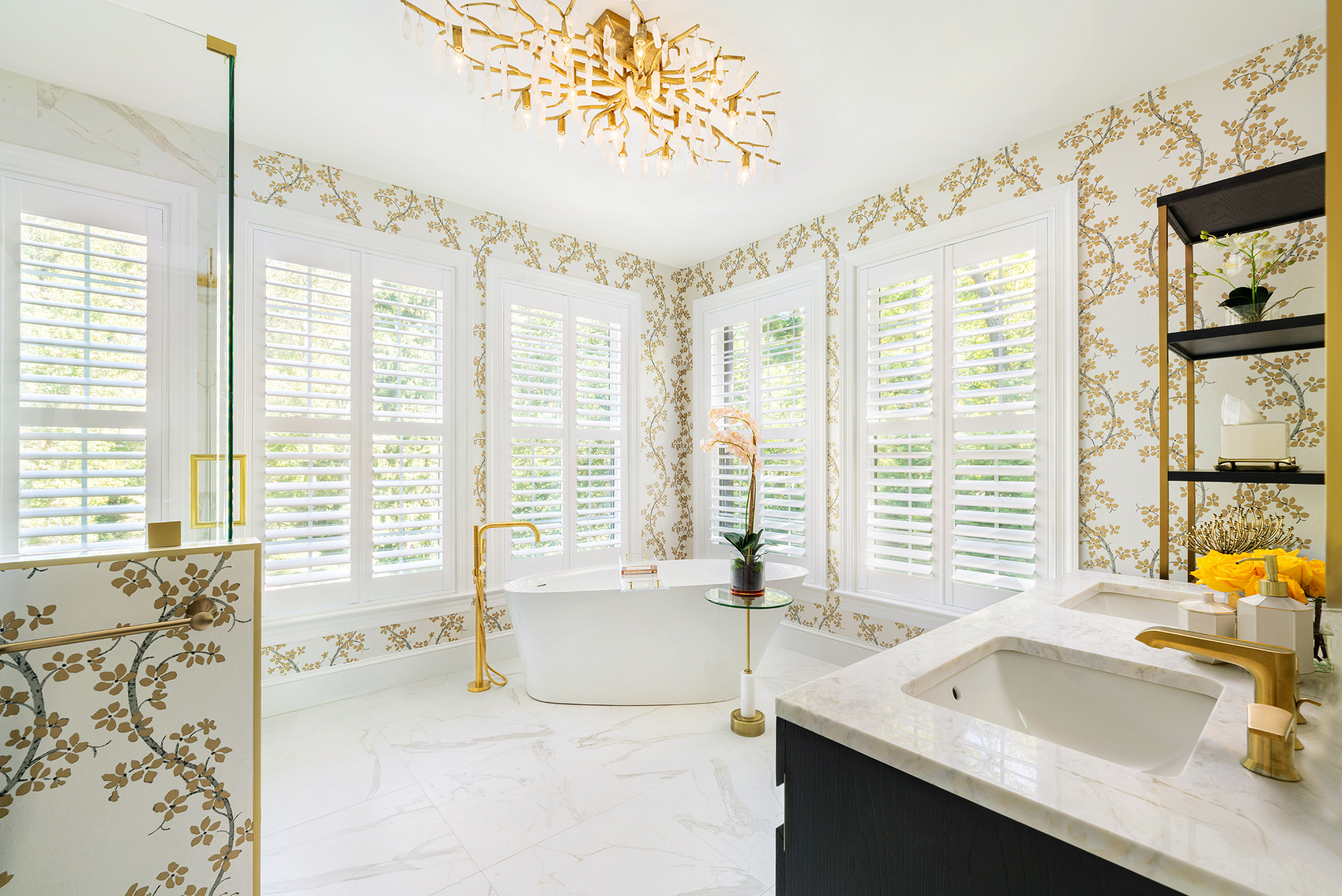
Mocha Mousse isn’t reserved for walls and furniture. You can utilize it in your kitchen for a delectable look that will inspire you to make mouthwatering baked goods all year round. Use brown and other similar tones for kitchen cabinets paired with gold hardware or natural wood tones. Also, this shade can make your bathroom feel like a five-star spa — the perfect place to start your day or get ready for bed at night.
Neutral Throws and Decor
Brown is a perfect addition to your house because you can use it all year — it matches the colours of all the seasons if used intentionally. One way to disperse this hue gracefully is through comfortable elements and decor. Add texture and warmth with throws and cushions in Mocha Mousse, hang up brown painted frames and place neutral candle sticks on your mantel. Whatever you can do to make the space more inviting while also scattering this colour throughout is a win.
Big Area Rugs
If the rest of your room is busy with colour or patterns, a solid-brown area rug acts as an anchor, laying a strong foundation for the rest of the space to build on. Not only does the colour look chic and high-class, but using it in an area rug ensures the room is cohesive from floor to ceiling — let’s face it, sometimes the floor is forgotten in redesign projects.
What Colours To Pair With Mocha Mousse
Generally, you don’t want to introduce a new colour without first knowing if it will work with the existing shades. Lucky for you, Mocha Mousse matches so many colours, making it the perfect hue to add to your palette. And to make your choices easier, Pantone created five unique colour combinations to complement their shade of choice for the new year:
Relaxed Elegance
This neutral colour palette includes beautiful, subtle colours that will make you feel wrapped in a chic hug:
- Cannoli Cream.
- Cream Tan.
- Safari.
- Sirocco.
- Chanterelle.
- Baltic Amber.
- Chocolate Martini.
What Pantone has to say about it: “Revel in your own special moments. Imbued with a sensorial richness, PANTONE 17-1230 Mocha Mousse inspires us to curate experiences that boost personal comfort and wellness. From sweet treats to nature walks, the indulgence of simple pleasures that we can also gift and share with others.”
Floral Pathways
For a bouquet of stunning shades, select pastels and nature-inspired tones:
- Tendril.
- Cornflower Blue.
- Viola.
- Rose Tan.
- Cobblestone.
- Willow.
- Gardenia.
What Pantone has to say about it: “A cornucopia of suggestively scented floral tones, blended with a soft mocha and a shaded willow green, leads us down a cobblestone path.”
Uniquely Balanced
With a mix of warm and cool tones, Uniquely Balanced brings harmony and symmetry:
- Blue Jewel.
- Desert Flower.
- Cattleya Orchid.
- Spicy Mustard.
- Opera Mauve.
- Blue Curacao.
- Arabesque.
What Pantone has to say about it: “Mocha Mousse nestles in, offsetting the vibrancy of this uniquely balanced, multi-coloured and somewhat exotic grouping of tones both warm and cool.”
Deliciousness
Want your space to look like summer incarnate? Warm, pinky tones are the way to go:
- Bonbon.
- Party Punch.
- Winery.
- Mandarin Orange.
- Pink Lemonade.
- Caramel.
- Peach Cobbler.
What Pantone has to say about it: Tastefully tempting Mocha Mousse combines with other delicious hues in a delectable colour palette inspired by mouth-watering confections.
Subtle Contrasts
For a darker take on Mocha Mousse, bring a collection of shadowy yet glamorous colours together:
- Tapestry.
- Laurel Oak.
- Coffee Quartz.
- Arona.
- Warm Taupe.
- Dull Gold.
- Buffed Beige.
What Pantone has to say about it: “Sophisticated brown hues coalesce with nuanced contrasts of blue and gray for a classic and compatible statement.”
Some other general colours that would look stunning paired with Mocha Mousse are:
- Muted terracotta: Brings warmth and complements Mocha Mousse’s earthy tone.
- Olive green: Adds a natural and grounding vibe.
- Creamy beige: A soft contrast to enhance brown’s depth.
- Deep navy: Creates a refined and dramatic contrast.
- Gold: Adds luxurious touches that harmonize with the trending colour.
- Rich burgundy: Enhances the richness for a warm, opulent look.
- Blush pink: Offers a delicate, romantic pairing.
- Pale lavender: A calming and sophisticated counterpart.
- Light gray: Balances the warmth with cool neutrality.
- Teal or turquoise: Adds a pop of vibrant, contemporary energy.
- Mustard yellow: A lively complement for dynamic palettes.
- Coral: Balances warmth with a cheerful tone.
Have a Design Partner for 2025
Having a new colour to use as inspiration also means you have countless opportunities to incorporate it into your home. Exciting! When preparing your space for a new coat of paint, it pays to have a partner who knows how to execute your vision to perfection. Contact us today to schedule your complimentary design consultation!