Reading Time: 3 minutes
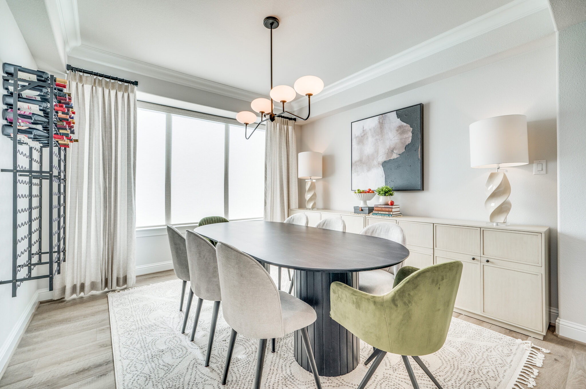
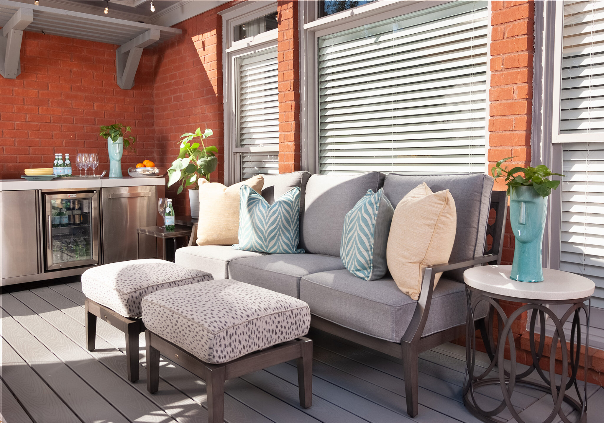
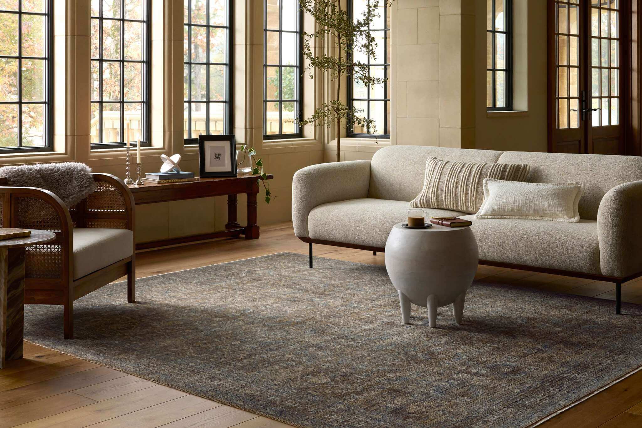
Planning to give any of your rooms a new look in the new year? Here are some new colour ideas to consider. A new set of four Sherwin-Williams colour palettes for 2023 was introduced at the High Point, N.C., home furnishings market. Here’s how Sherwin-Williams created 40 palettes combining 40 different colours.
Interior design is increasingly associated with mental health, and colour plays a significant role. We are moved by colour. Colour can set a mood and spark a conversation. In the words of colorpsychology.org: “It can excite or soothe your mood, raise or lower your blood pressure, and even whet your appetite! Whether it’s innate or learned, it’s undeniable that colour has a vital impact on how we go about our lives.”
The Sherwin-Williams colour palettes for 2023 emphasize “what is ours, who we are,” said Sue Wadden, director of Color Marketing. “The four new palettes remind us of the connection to the earth beneath our feet, the enduring beauty of ancient practices, the warmth of true compassion, the daily joys that make our world so wonderful.”
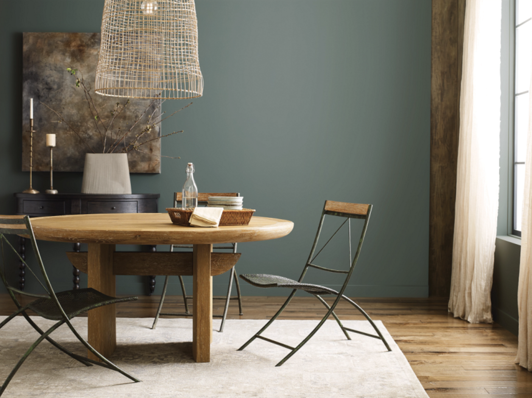
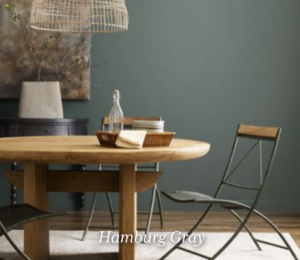
In the first palette, Biome is described as a tool for helping us understand the world and “seek perfect balance with the existing, ever-changing ecosystem.” We can “preserve peace in an atmosphere of delicate mushroom taupe, lichen gray, rich earth tones, and the colours of our sky’s cloud canopy.”
The first palette introduced is called Biome—described as helping us “seek perfect balance with the existing, ever-changing ecosystem.” We can “preserve peace in an atmosphere of delicate mushroom taupe, lichen gray, rich earth tones, and the colors of our sky’s cloud canopy.”
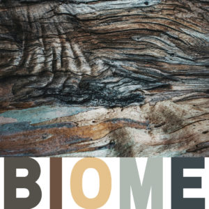
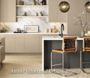
Biome’s colours are Urbane Bronze, Shiitake, Threshold Taupe, Antler Velvet, Redwood Medium Brown, Mount Etna, White Resin, Evergreen Fog, Hamburg Gray, and Silvermist.
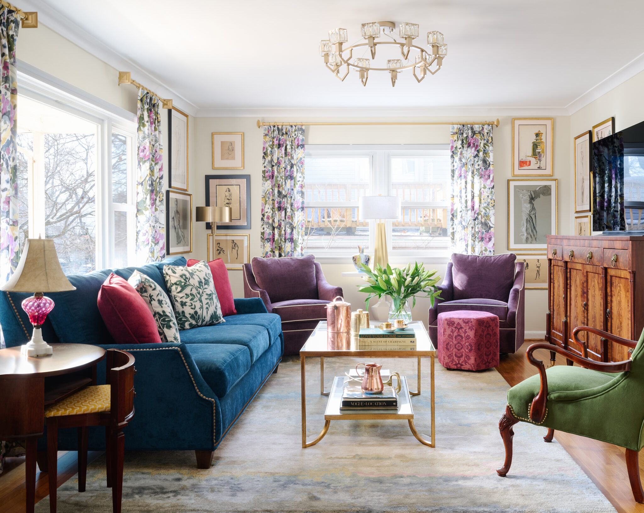
Lore’s palette is inspired by “the call to create that is woven into the fiber of our being, present in the very air we breathe, binding us together in a community of makers that spans centuries and crosses cultures.” We are encouraged to “reconnect with an intricate mix of ancient reds, powdery pastels, and bevy of bejeweled tones—and embrace the transformative power of passionate creativity.”
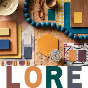
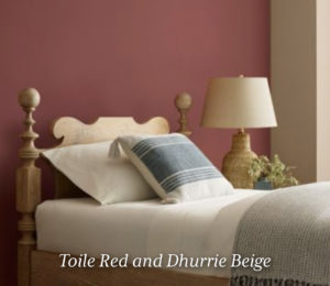
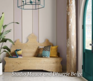
Lore’s colours are Wallflower, Studio Mauve, Carnelian, Toile Red, Serape, Dhurrie Beige, Pediment, Mineral Gray, Blue Peacock, and Nugget.
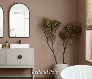
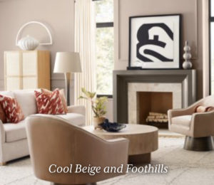
“Our communal well-being” is Nexus’s theme. These colours evoke feelings of “a quiet place of healing, a realm where the energy we give is returned to us tenfold, where the warmth of loving kindness reminds us of what it feels like to come home.”

Nexus’s colours “enkindle a sense of support and serenity with a potter’s palette of natural clays and sunbaked desert sands.” They are Lei Flower, Reddened Earth, Redend Point, Likeable Sand, Kestrel White, Foothills, Chatura Gray, Cool Beige, Malted Milk, and Emerging Taupe.
The Origin palette is all about “mapping our inner world.” Sherwin-Williams’s colour team suggests that “to chart a path through the wild and wonderful landscape of our lives, we begin within. By layering our fondest memories and future hopes, we created vibrancy and joy in the present moment.”
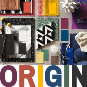
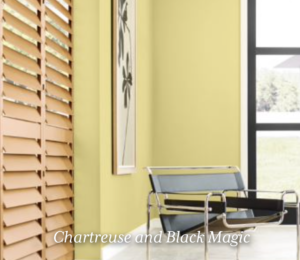
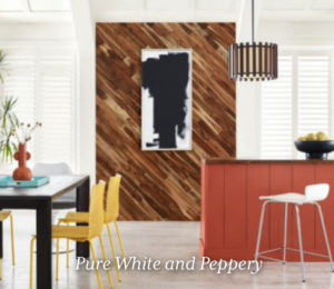
Origin’s free-spirited brights, magnetic deeps, and a whisper of restful neutrals help us to recharge. They include Fabulous Grape, Peppery, Goldfish, Chartreuse, Kale Green, Pure White, Skyline Steel, Homestead Brown, Black Magic, and Indigo.
Is it time to incorporate new colour combinations into your next room makeover? We’d love to hear from you. Book a discovery call with Saree Parry Design here.