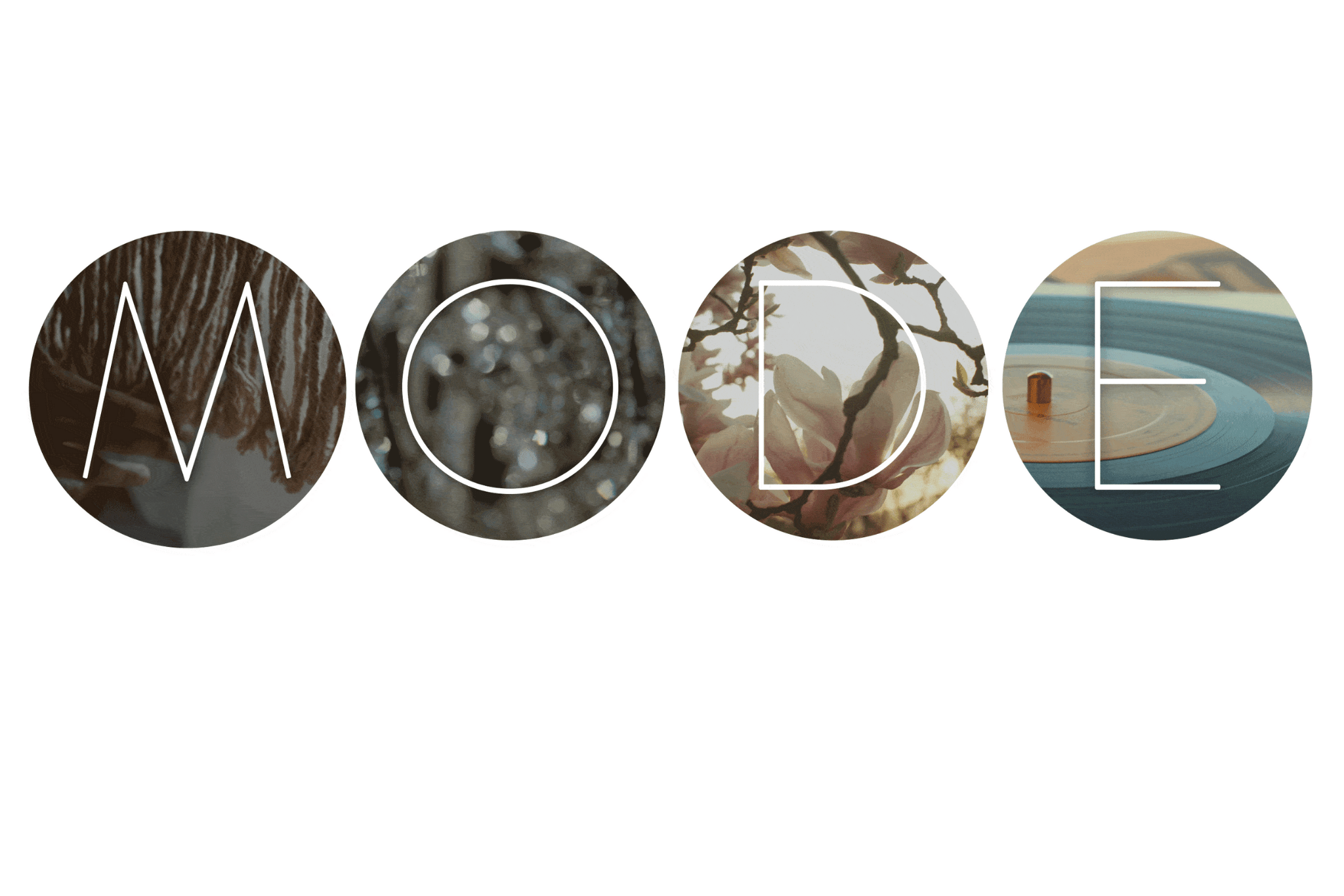
Towards the end of each year, paint companies announce their colour selections for the new year. In October at High Point Market, North America’s largest home furnishings trade show, Sherwin-Williams introduced its MODE: Colormix ® Forecast 2022.
The power of colour
Colour has the power to change how a room makes us feel. In Sherwin-Williams’ words: “There is so much more to color than meets the eye. It’s a part of our identity. It moves us. It has the power to change the very essence of everything it touches. Color can set a mood, create a conversation, soothe us and ground us.” The names chosen for the different palettes in Colormix ® Forecast 2022 reflect this sentiment.
So, what is Sherwin-Williams’s MODE Colormix® Forecast 2022?
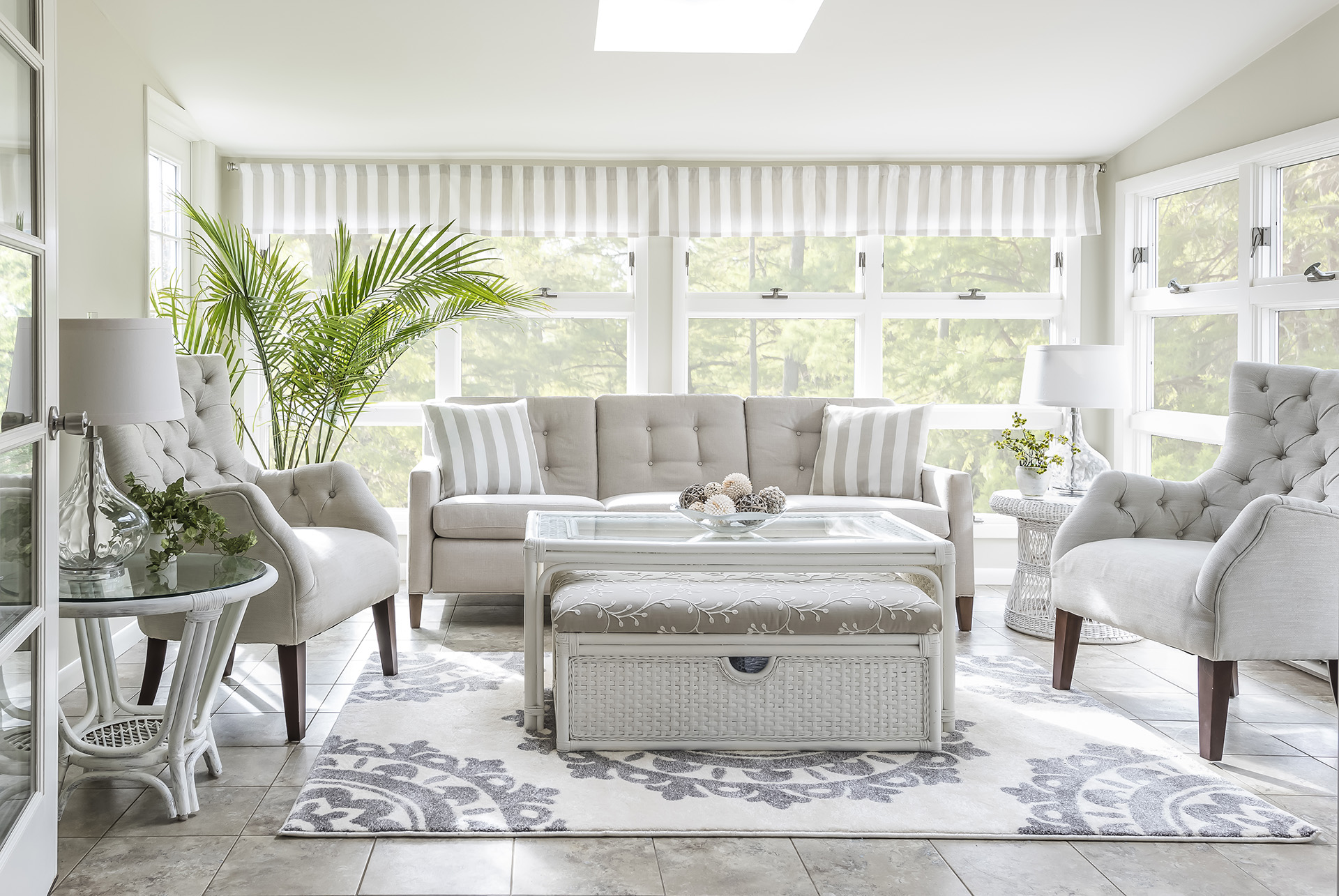
Well, MODE consists of four palettes that reflect today’s home fashion trends. The first palette introduced is called method, described as “conveying nature’s processes, the gentle acts of becoming, showing themselves in a collection of organic neutrals and tonal luxury.” If you admire the natural beauty of the outdoors, paired with a touch of art deco, this collection of colours is for you.
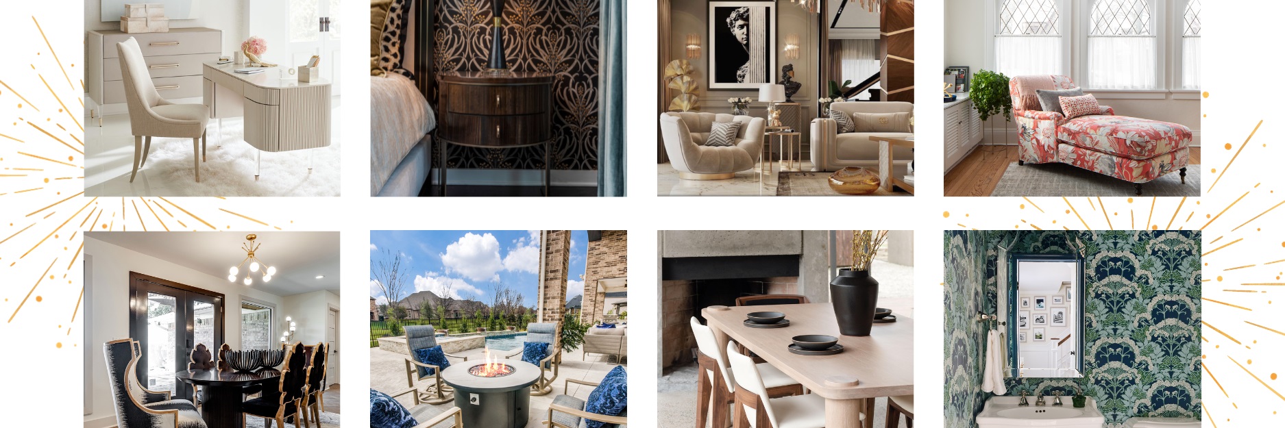
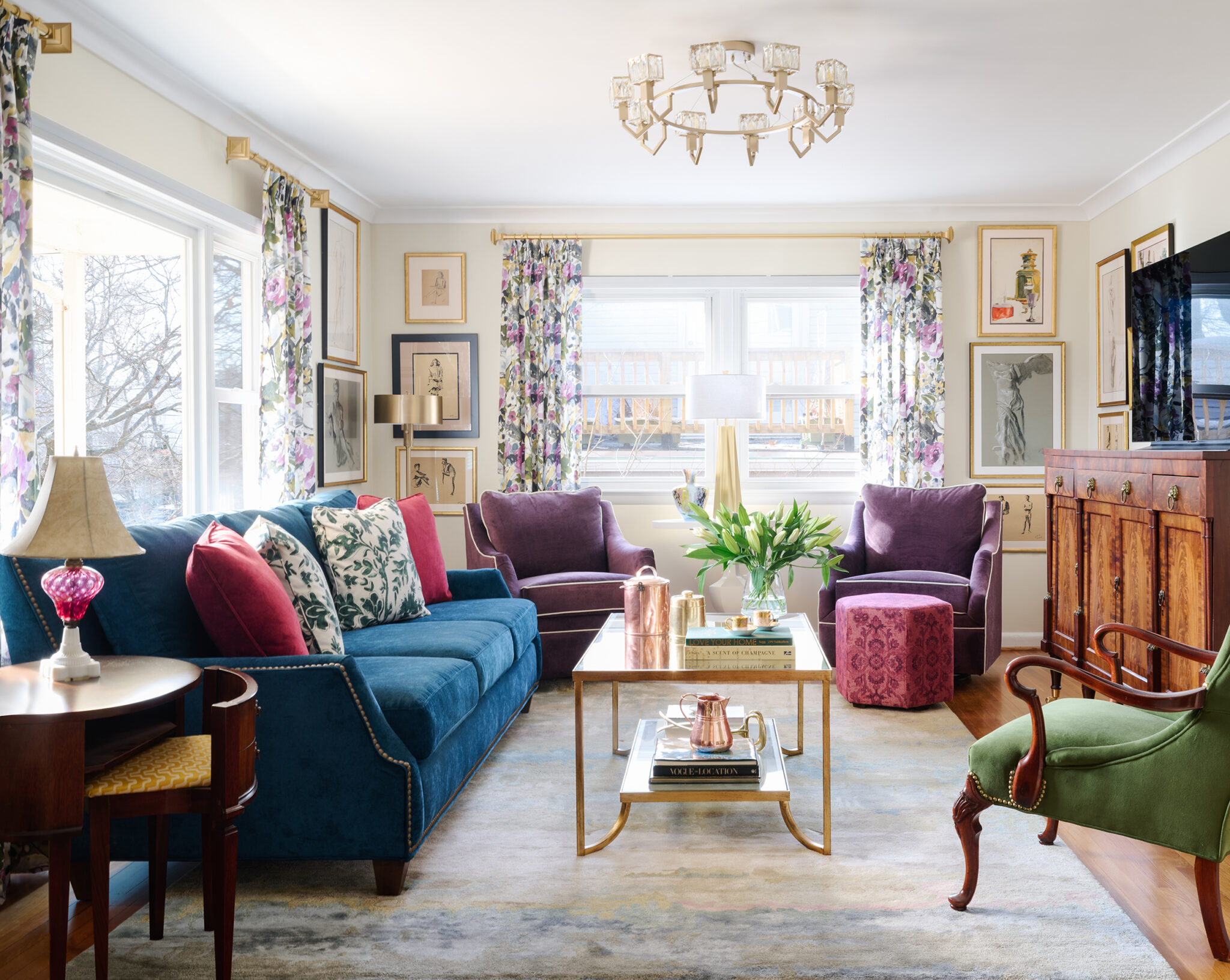
Sherwin-Williams’s second colour palette is called opus. It’s made up of “dusky deep tones and unexpected accents” and was inspired by modern materialism, glam-industrial, and theatre. The combination of deep warm colours and vivid cool colours, is balanced with rich neutrals, creating “a new kind of classical, to set drama and emotion to art of good style, and to never, ever fade into the background”. If you’re in love with colour and enjoy the drama of bold spaces, then this colour palette is for you.
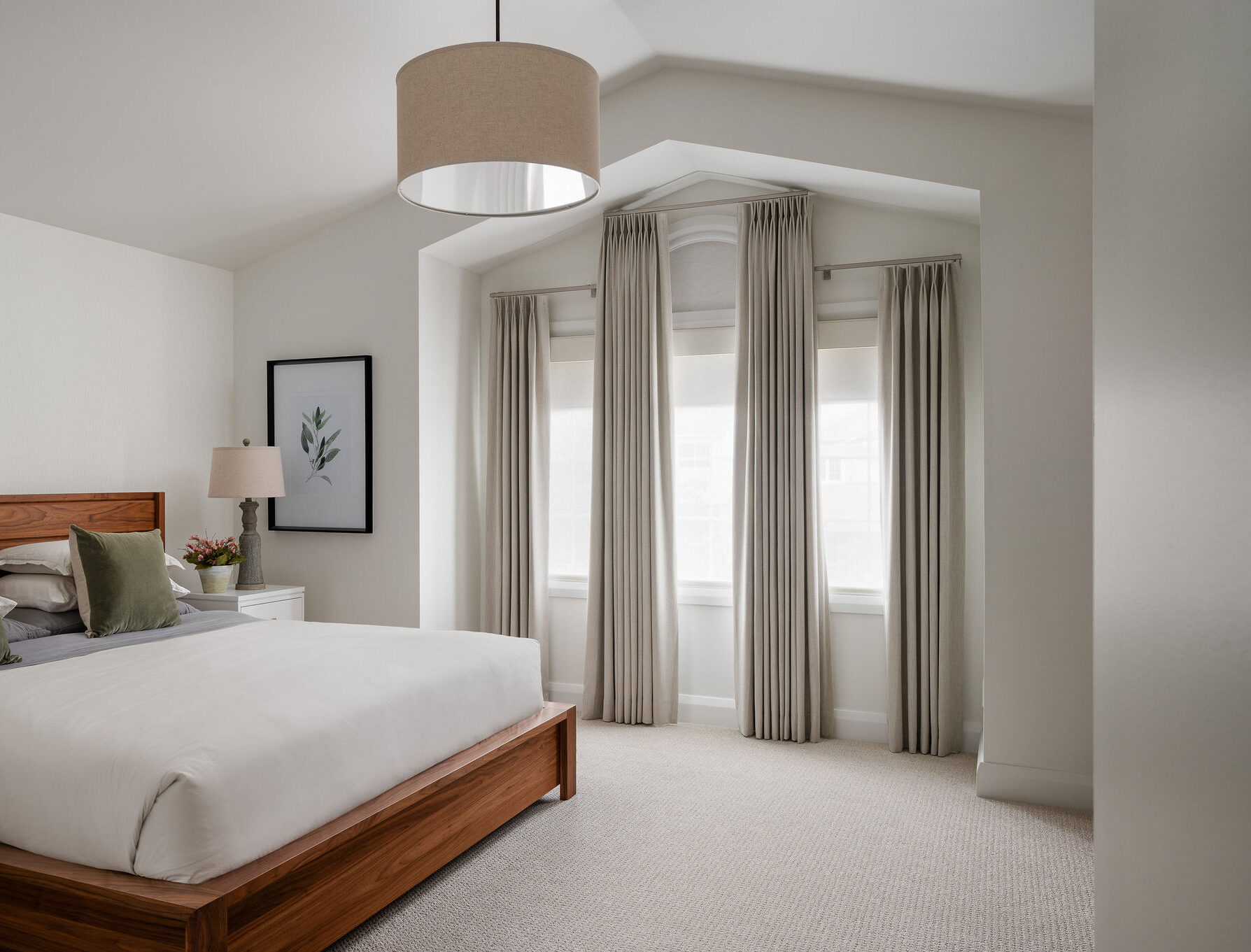
If you are looking for a bit of whimsy, consider MODE’s third palette called dreamland. This palette evokes that joyful feeling of regeneration when spring finally emerges, and when we spot flowering buds after a long and dark winter. It features “pearlescent tones, new-growth greens, and lavish pinks that will create a space where fresh ideas flourish.” Is this your colour palette?
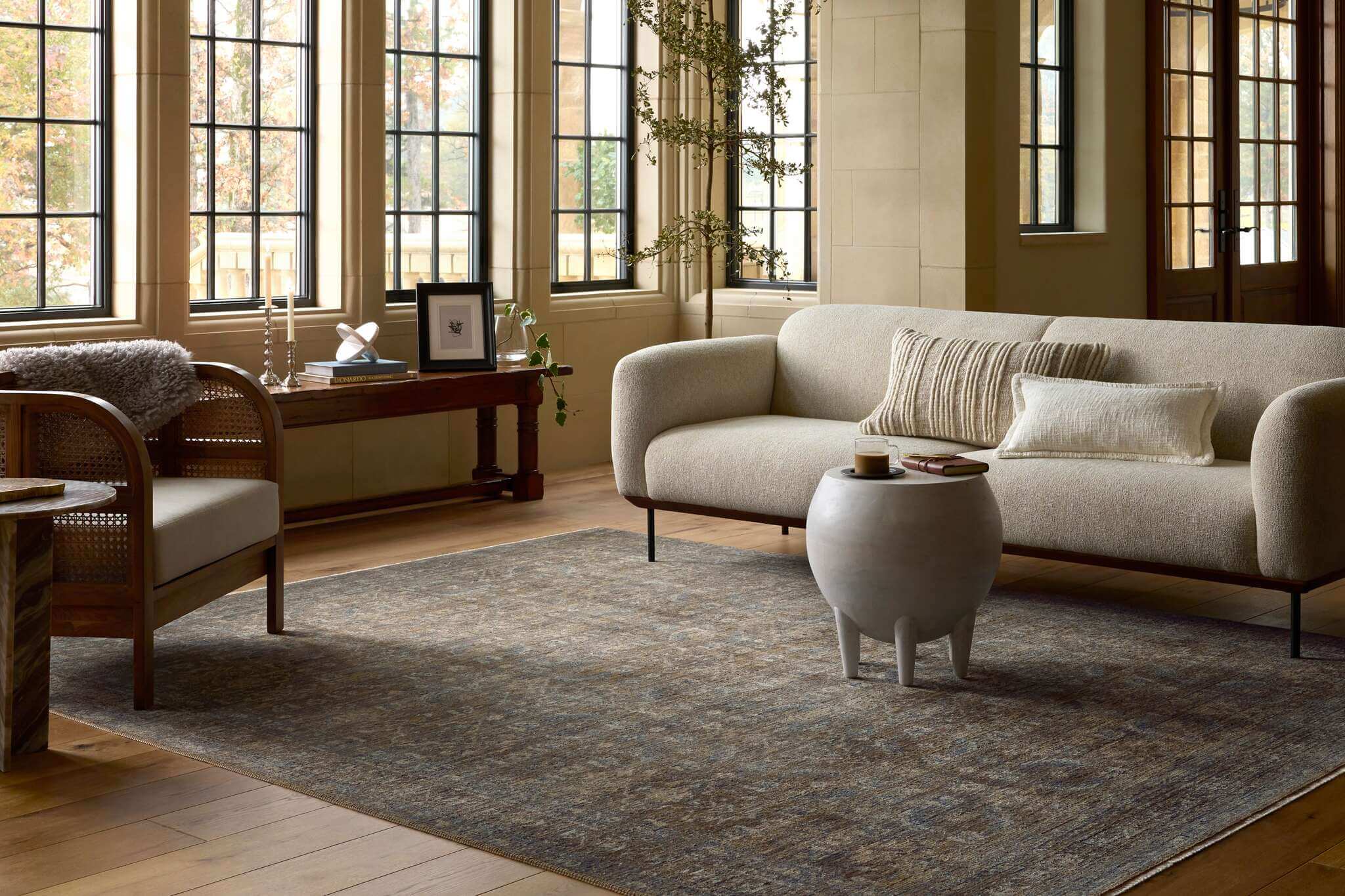
Finally, the fourth palette, ephemera, is a nod to “the timelessness of sleek and functional midcentury modern design”. This collection of colours embodies a feeling of nostalgia for “the unwavering optimism of what could someday be” and is made up of primary colours reincarnated in lighter tones and deeper shades. If you’re drawn to the colours of 1960’s and mid-70’s game shows and the saturated colours of vinyl labels, this palette is for you.
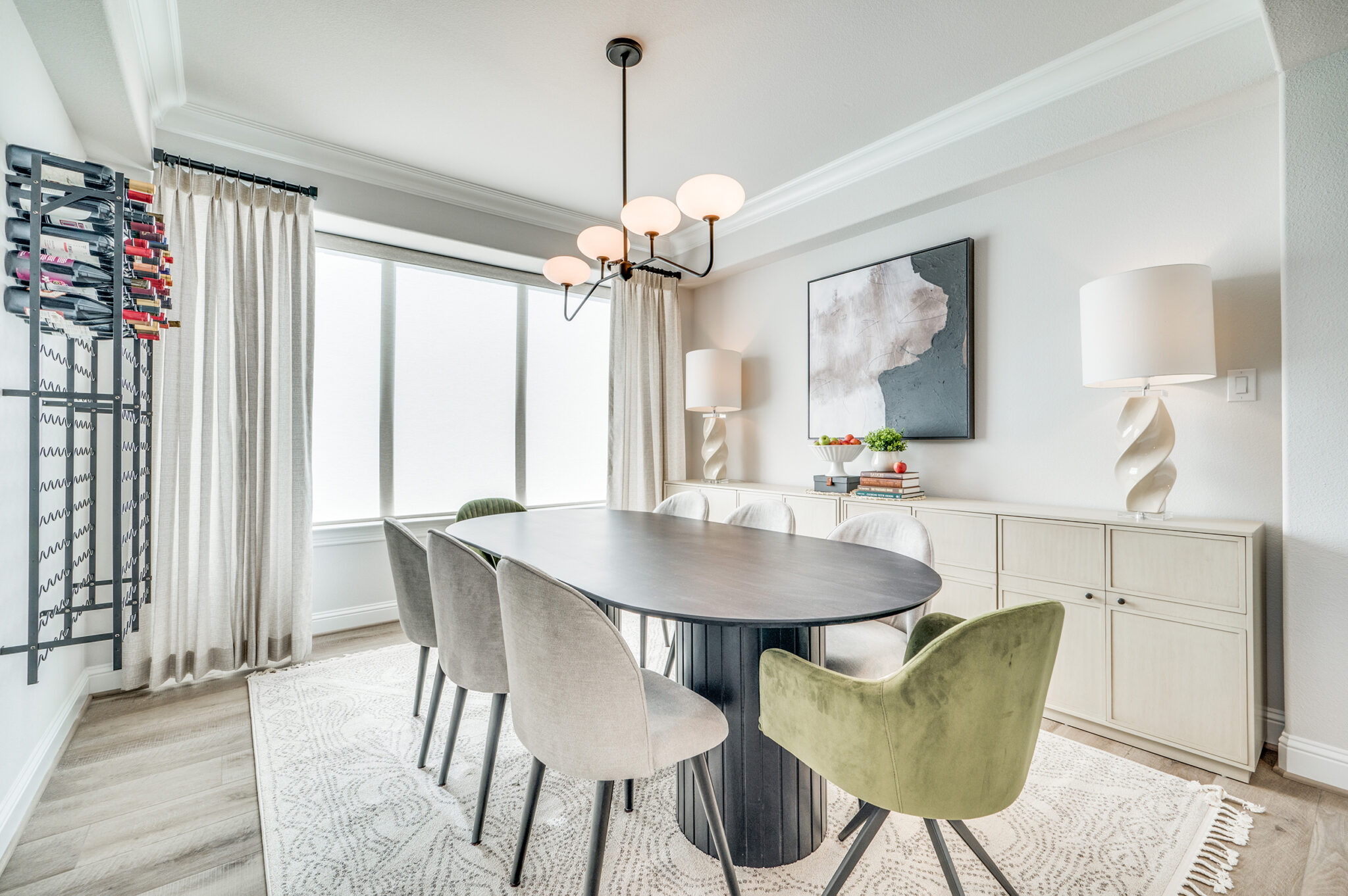
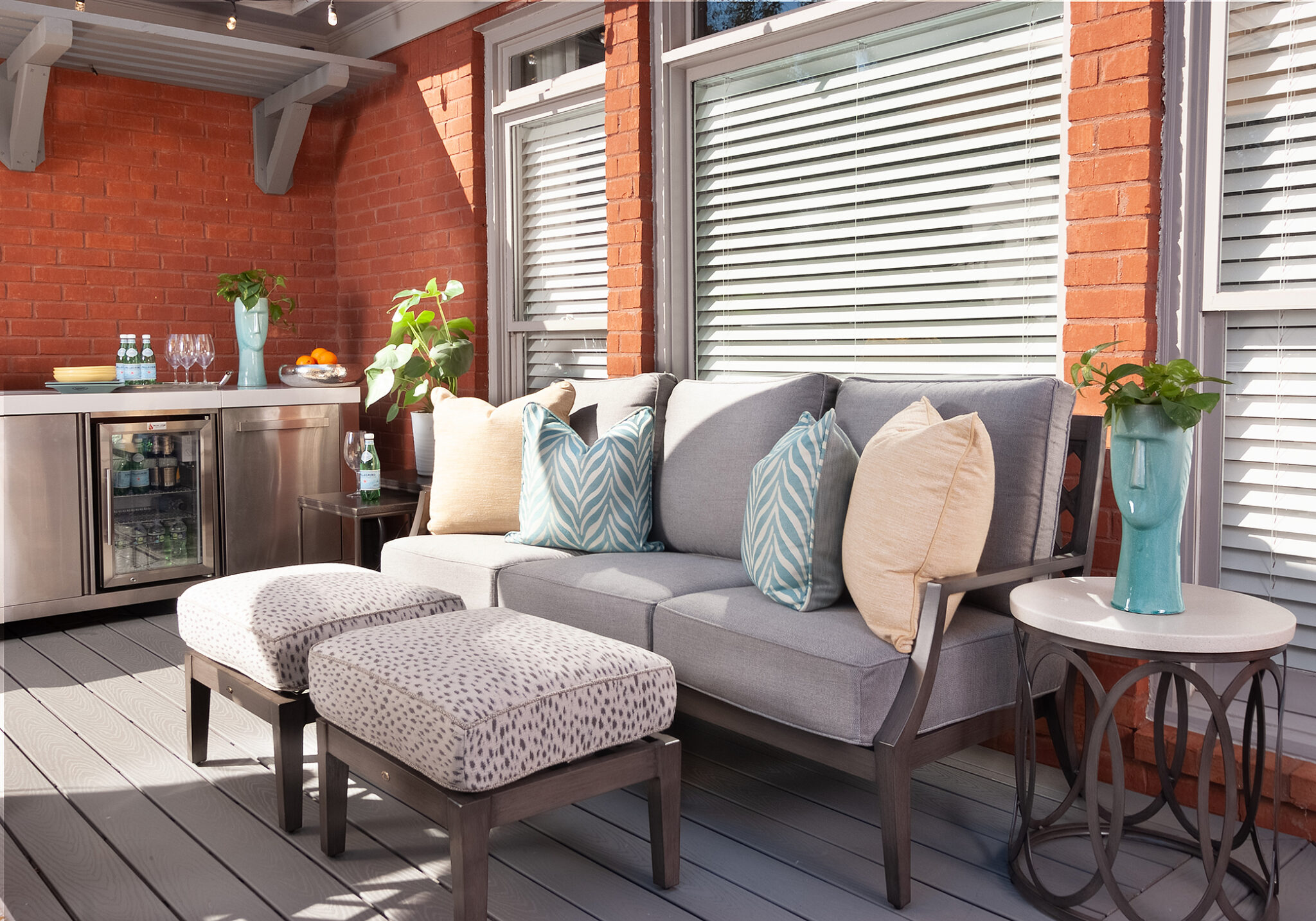
When changing your room’s colour scheme, know that the walls are just one of several components available for you to work with. Consider renewing accessories, such as throw pillows, wall décor and artwork, and at least one investment piece of furnishing, such as window treatments or an area rug. You will bring a whole new look and feel to your home by following this holistic approach to your makeover’s colour scheme.
If you need help pulling it all together, simply contact us to schedule a discovery call. During that first conversation, you can explain what you need help with so that we’ll be prepared for your complimentary in-home consultation. At the home consultation, not only will we see what has gotten you stuck, but we’ll also learn more about your ultimate vision for your space. This first-hand knowledge will give the insight needed to create a custom design just for you (which will, of course, include the right colours for the mood you want to create😉 ).
Contact us today to get your project in motion.

